
-
Trouble logging in? Send us a message with your username and/or email address for help.
-
Hello all! We will be performing a website & forum update soon. You may get logged out so now is the time to make sure your email address in your account is correct - go to your account to check it and update it now. Send us a message with your username and/or email address if you need help.
You are using an out of date browser. It may not display this or other websites correctly.
You should upgrade or use an alternative browser.
You should upgrade or use an alternative browser.
Vote for Visit South Walton Logo
- Thread starter SoWal Staff
- Start date
New posts

Tried to do a screenshot from the pdf showing votes. But you can open it and take a look.
About heads rolling.... maybe not or it may come to that once it is realized by powerful bed tax collectors how expensive this is going to be - and such a short time after spending so much for a logo a couple of years ago (although that may be written off as BP money). I agree the current logo is bad. But why throw good money after bad? Let's do it right.
It reportedly cost about a million bucks to add Gulf Place to marketing materials. The logo is a much bigger deal.
About the democratic process - sometimes leadership is needed from people who have sense. Committees and voting often achieve a watered down compromise solution. Sometimes doing the right thing takes courage and vision. Apparently what we are really lacking in this county is vision and leadership.
A real designer would come up with 3 excellent designs with reasoning behind each one and pitch the one they like best and have reasons for it. An excellent logo usually gets near universal approval. But Bagby is also right that people won't agree in ten years. Not with a collection of poo like the one we have been presented with.
Sorry - wish I could be more succinct like Andy.


Fresh Paint
New posts
Jim Tucker
Beach Fanatic
I agree with all that you said (I couldn't open attachment), except the last line. I don't think "heads will roll", but a whole of eyes are rolling in their heads.
Tried to do a screenshot from the pdf showing votes. But you can open it and take a look.
About heads rolling.... maybe not or it may come to that once it is realized by powerful bed tax collectors how expensive this is going to be - and such a short time after spending so much for a logo a couple of years ago (although that may be written off as BP money). I agree the current logo is bad. But why throw good money after bad? Let's do it right.
It reportedly cost about a million bucks to add Gulf Place to marketing materials. The logo is a much bigger deal.
About the democratic process - sometimes leadership is needed from people who have sense. Committees and voting often achieve a watered down compromise solution. Sometimes doing the right thing takes courage and vision. Apparently what we are really lacking in this county is vision and leadership.
A real designer would come up with 3 excellent designs with reasoning behind each one and pitch the one they like best and have reasons for it. An excellent logo usually gets near universal approval. But Bagby is also right that people won't agree in ten years. Not with a collection of poo like the one we have been presented with.
Sorry - wish I could be more succinct like Andy.
Beach Runner
beats on hood
I agree with Jim Tucker. The logo should make it very clear that South Walton has something to do with beaches. 99% of the time when I tell people we have a home in South Walton, they ask where that is. The only thing I can do to explain to them that South Walton has something to do with a beach is say, "Well, it's halfway between Destin and Panama City Beach." Only the umbrella logo makes that clear, although I remember on this very message board that posters complained that the umbrellas reminded them of the symbol for a fallout shelter. I know it's too late to say anything, but I had no confidence that our voices wouldn't affect the final result. So now we have an eyebrow and a mustache, not exactly clear that South Walton has anything to do with beaches unless you already know. But maybe that's good -- the roads and the beaches in South Walton are already crowded enough. We don't need more visitors.
Last edited:

30A Skunkape
Skunky
I voted umbrella, but on the bright side, we no longer have the feminine hygiene font to deal with.
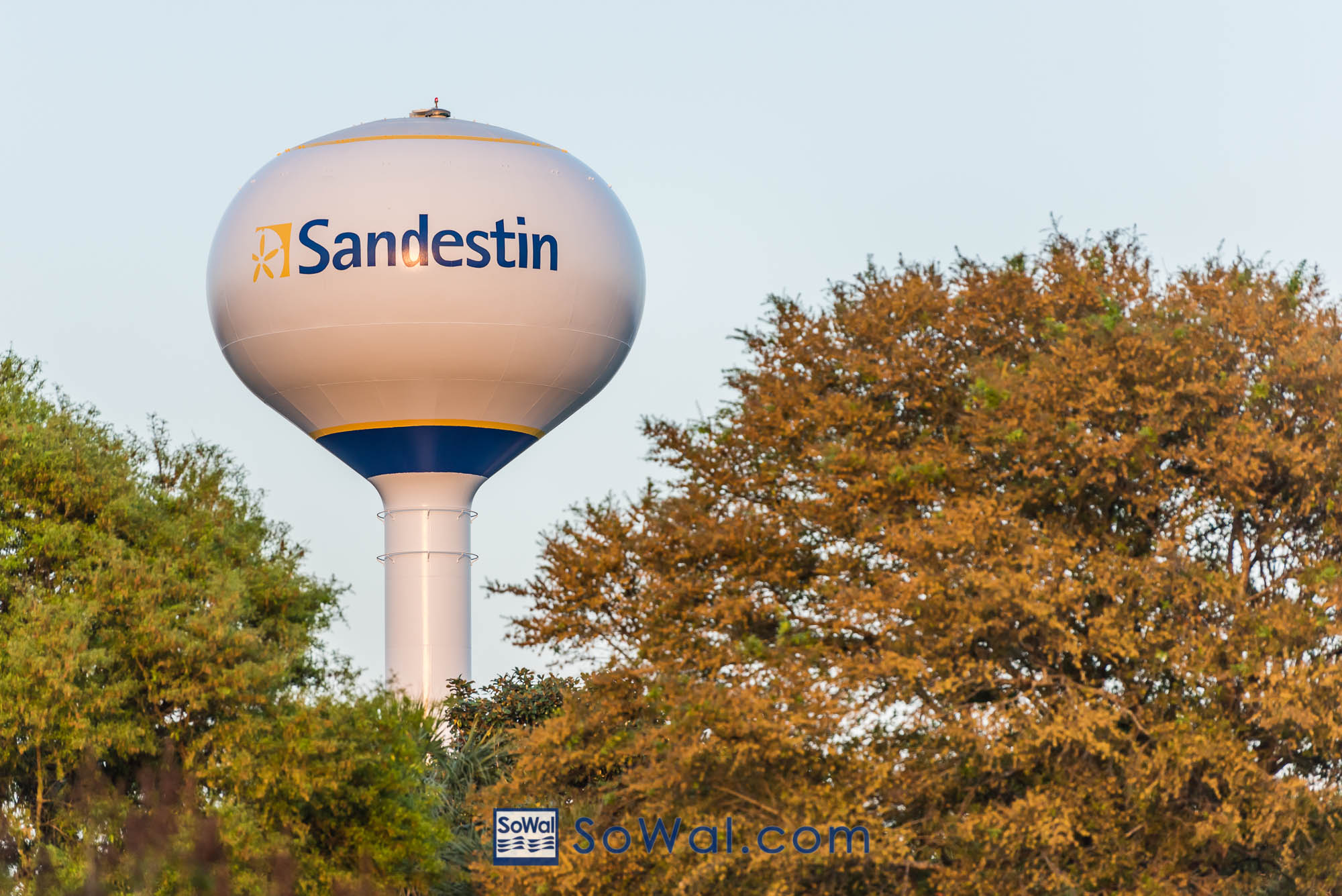
If they paint the new logo on the water tower, I'm going to think of...

If they paint the new logo on the water tower, I'm going to think of...

Kurt
Admin
Top left with the red and white umbrellas.
Imagine how much better that logo will look on a white background on the Sandestin water tower. Right now, it's that aqua cursive logo on a vomit colored background. Am I right?
Fresh Paint